Both the title ’The Grace of a Nightingale’ and the cover design have various connotations – nature, nursing, freedom, spirituality (the nightingale bird has spiritual, love and poetic connotations which have developed in many cultures over centuries) – all of which are big themes within the book
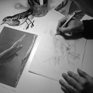
My designer read (from cover to cover) the entire book – both the unedited version and the newly finalised version. And both he and I discussed the book at length to develop the cover idea.
The nightingale was chosen as she is a reoccurring icon/symbol throughout the book. She is first apparent when I was 4 years old whilst staying on a “Nightingale ward”, then again as a sketch I did of Florence Nightingale on my bedroom wall. This continues until the nightingales final appearance is the last chapter of the book.
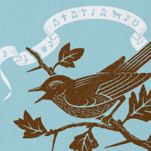
The ribbon which is depicting the ‘Nightingale’ song contains various important symbols derived from many of the stories within the book. There are 3 crosses….the Christian crucifix,the Tao cross for St Francis and the Caduceus for medicine and nursing. Others include a horse shoe, paw print, musical notes and finally leaves and flowers from the natural world. These are subtle as to invite the reader to discover and understand them as they read the book.
The typography is delicate yet has a strength, almost fragile but sturdy, . . . and is feminine . Again this very much reflects ME. The choice of colours (blue, brown and white) are those of water/sky, earth and light – all are elements which again strongly theme throughout the book. The woodcut/linocut illustrative style was chosen to give a naturalistic feel.
The overall impression is to create a beautiful, graceful, elegant and feminine cover which again is a reflection of the essence of me and the book.
Book design by: Monomo & Co, UK.